I-Responsive Web Design – Introduction
What is Responsive Web Design?
Responsive web design makes your web page look good on all devices.
Responsive web design uses only HTML and CSS.
Responsive web design is not a program or a JavaScript.
Designing For The Best Experience For All Users
Web pages can be viewed using many different devices: desktops, tablets, and phones. Your web page should look good, and be easy to use, regardless of the device.
Web pages should not leave out information to fit smaller devices, but rather adapt its content to fit any device:
Desktop

Tablet

Phone
It is called responsive web design when you use CSS and HTML to resize, hide, shrink, enlarge, or move the content to make it look good on any screen.
II-Responsive Web Design – The Viewport
What is The Viewport?
The viewport is the user’s visible area of a web page.
The viewport varies with the device, and will be smaller on a mobile phone than on a computer screen.
Before tablets and mobile phones, web pages were designed only for computer screens, and it was common for web pages to have a static design and a fixed size.
Then, when we started surfing the internet using tablets and mobile phones, fixed size web pages were too large to fit the viewport. To fix this, browsers on those devices scaled down the entire web page to fit the screen.
This was not perfect, but a quick fix.
Setting The Viewport
HTML5 introduced a method to let web designers take control over the viewport, through the <meta> tag.
You should include the following <meta> tag in all your web pages:
<meta name="viewport" content="width=device-width, initial-scale=1.0">
The width=device-width part sets the width of the page to follow the screen-width of the device (which will vary depending on the device).
The initial-scale=1.0 part sets the initial zoom level when the page is first loaded by the browser.
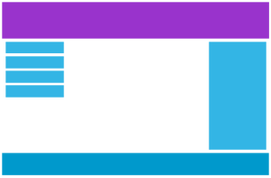
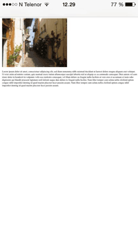
Here is an example of a web page without the viewport meta tag, and the same web page with the viewport meta tag:
Without the viewport meta tag
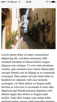
With the viewport meta tag
If you are browsing this page with a phone or a tablet, you can click on the two links to see the difference.
III-Responsive Web Design – Grid-View
What is a Grid-View?
Many web pages are based on a grid-view, which means that the page is divided into columns.Using a grid-view is very helpful when desgning web pages. It makes it easier to place elements on the page.
A responsive grid-view often has 12 columns, and has a total width of 100%, and will shrink and expand as you resize the browser window.
IV-Responsive Web Design – Media Queries
What is a Media Query?
Media query is a CSS technique introduced in CSS3.
It uses the @media rule to include a block of CSS properties only if a certain condition is true.
Example
If the browser window is smaller than 500px, the background color will change to lightblue:
@media only screen and (max-width: 500px) {
    body {
        background-color: lightblue;
    }
}
Add a Breakpoint
Earlier in this tutorial we made a web page with rows and columns, and it was responsive, but it did not look good on a small screen.
Media queries can help with that. We can add a breakpoint where certain parts of the design will behave differently on each side of the breakpoint.
Desktop
Phone
Use a media query to add a breakpoint at 768px:
Example
When the screen (browser window) gets smaller than 768px, each column should have a width of 100%:
/* For desktop: */
.col-1 {width: 8.33%;}
.col-2 {width: 16.66%;}
.col-3 {width: 25%;}
.col-4 {width: 33.33%;}
.col-5 {width: 41.66%;}
.col-6 {width: 50%;}
.col-7 {width: 58.33%;}
.col-8 {width: 66.66%;}
.col-9 {width: 75%;}
.col-10 {width: 83.33%;}
.col-11 {width: 91.66%;}
.col-12 {width: 100%;}

@media only screen and (max-width: 768px) {
    /* For mobile phones: */
    [class*="col-"] {
        width: 100%;
    }
}
Always Design for Mobile First
Mobile First means designing for mobile before designing for desktop or any other device (This will make the page display faster on smaller devices).
This means that we must make some changes in our CSS.
Instead of changing styles when the width gets smaller than 768px, we should change the design when the width getslarger than 768px. This will make our design Mobile First:
Example
/* For mobile phones: */
[class*="col-"] {
    width: 100%;
}
@media only screen and (min-width: 768px) {
    /* For desktop: */
    .col-1 {width: 8.33%;}
    .col-2 {width: 16.66%;}
    .col-3 {width: 25%;}
    .col-4 {width: 33.33%;}
    .col-5 {width: 41.66%;}
    .col-6 {width: 50%;}
    .col-7 {width: 58.33%;}
    .col-8 {width: 66.66%;}
    .col-9 {width: 75%;}
    .col-10 {width: 83.33%;}
    .col-11 {width: 91.66%;}
    .col-12 {width: 100%;}
}
Another Breakpoint
You can add as many breakpoints as you like.
We will also insert a breakpoint between tablets and mobile phones.
Desktop
Tablet
Phone
We do this by adding one more media query (at 600px), and a set of new classes for devices larger than 600px (but smaller than 768px):
Example
Note that the two sets of classes are allmost identical, the only difference is the name (col- and col-m-):
/* For mobile phones: */
[class*="col-"] {
    width: 100%;
}
@media only screen and (min-width: 600px) {
    /* For tablets: */
    .col-m-1 {width: 8.33%;}
    .col-m-2 {width: 16.66%;}
    .col-m-3 {width: 25%;}
    .col-m-4 {width: 33.33%;}
    .col-m-5 {width: 41.66%;}
    .col-m-6 {width: 50%;}
    .col-m-7 {width: 58.33%;}
    .col-m-8 {width: 66.66%;}
    .col-m-9 {width: 75%;}
    .col-m-10 {width: 83.33%;}
    .col-m-11 {width: 91.66%;}
    .col-m-12 {width: 100%;}
}
@media only screen and (min-width: 768px) {
    /* For desktop: */
    .col-1 {width: 8.33%;}
    .col-2 {width: 16.66%;}
    .col-3 {width: 25%;}
    .col-4 {width: 33.33%;}
    .col-5 {width: 41.66%;}
    .col-6 {width: 50%;}
    .col-7 {width: 58.33%;}
    .col-8 {width: 66.66%;}
    .col-9 {width: 75%;}
    .col-10 {width: 83.33%;}
    .col-11 {width: 91.66%;}
    .col-12 {width: 100%;}
}
It might seem odd that we have two sets of identical classes, but it gives us the opportunity in HTML, to decide what will happen with the columns at each breakpoint:
HTML Example
For desktop:
The first and the third section will both span 3 columns each. The middle section will span 6 columns.
For tablets:
The first section will span 3 columns, the second will span 9, and the third column will span 12 columns:
<div class="row">
<div class="col-3 col-m-3">...</div>
<div class="col-6 col-m-9">...</div>
<div class="col-3 col-m-12">...</div>
</div>
Orientation: Portrait / Landscape
Media queries can also be used to change layout of a page depending on the orientation of the browser.
You can have a set of CSS properties that will only apply when the browser window is wider than its height, a so called “Landscape” orientation:
Example
The web page will have a lighblue background if the orientation i in landscape mode:
@media only screen and (orientation: landscape) {
    body {
        background-color: lightblue;
    }
}
V-Responsive Web Design – Frameworks
There are many existing CSS Frameworks that offers Responsive Design.
They are free, and easy to use.
W3.css
A CSS framework based only on CSS
To learn more about W3.CSS, go toW3CSS Tutorial.
Bootstrap
The most popular Framework is Bootstrap, it uses HTML, CSS and jQuery to make responsive web pages.
To learn more about Bootstrap, go to getbootstrap.com
Skeleton
Another popular framework is Skeleton, it uses only CSS to make responsive web pages.